


CREATION LAB
- Jan 26
- 26 min read
Updated: May 16
THE CREATION OF ROOTS TO FATE
Welcome to my final project where I create my first animated story - Roots to Fate. In this blog I will document the entire post-production journey through its contextual, professional, animatic, sculptural and visual development. This work aims to centre indigenous representation and ecological consciousness, whilst promoting my concept and skills to wider audiences, potential collaborators and investors.
FIRST DAY BACK


Today was mainly focused on the structure of the upcoming months. There were a lot of important deadlines which made me start thinking more seriously about how I want to communicate and present my project. Two words that stood out were “autonomy” and “play”.
EAST SIDE PROJECTS
23rd Janurary 2026
Nar Marattu: Sarah Al Saraaj's Exhibition


I’m really glad to have become a member of Eastside Projects and to have attended Sarah Al-Sarraj’s exhibition opening. I almost didn’t go because of delayed transport but it ended up being an amazing experience.
It was surreal how many people I recognised and connected with there, friends, creatives, and people from across Birmingham gathered together in one space; our city's a small world. I also spoke with Sarah herself about her work and the possibility of further discussion which went really well.
The exhibition itself was beautiful. I found myself completely immersed in the work, that every time I looked around I discovered something within it ; Layers of details such as modern coordinates hidden within an ancient artefact and later uncovered by future descendants, like ancestral messages travelling through time. The corpse of an ox lying within the remains of a once-beautiful marshland, or a missile inscribed with poetry by Mahmoud Darwish. I was also really drawn to the contrast between ancient and modern technology shown through the jewellery, architecture, and imagery across the exhibition.
Its meaningful to see so much of my homeland represented in this way - within a suspended realm where past, present, and future all coexist together, shaped by ancestry, futurism, memory, and ecology.
24th Janurary 2026
World building and Cartographies Workshop


No less than 12 hours later, I attended Sarah's world-building and cartography workshop co-run by Joseph Boyle, another practitioner and marine biologist that I also made a really good connection with. The workshop began with an interesting mindfulness exercise where we closed our eyes and Sarah guided us through different reflections - We focused on different parts of our bodies, and with each one we reflected on aspects of our existence: how we got here, our lives, our past, present and dreams, our ancestors, and how we are all connected to each other. After that, we had to visualise our journeys from our homes to Eastside. Everybody’s journeys were completely different, and it was really cool seeing how all of these strangers had ended up together in the same room.


For the main exercise, we were each given different maps from across various cultures, timelines, and geographies. Conveniently I was given an ancient map of my homeland and the person next to me had this beautiful Indigenous Inuit map. Others were given maps of bird migrations, biodiverse regions, and different natural systems. We had to try and make sense of the maps, what they represented, and how they all connected. My Mesopotamian map is abstract and circular, for most it wouldn't make sense but to me it completely did. I could even pinpoint the location of my grandma's house based on the names.

We ended up having really long and engaged conversations with each other, learning from all of our different perspectives and interpretations of the land. Near the end we recreated our own maps based on places that held meaning to us. Mine represents my motherland through my worldview. Geographical regions intersecting, and my mum within it because she too is my origin.
This workshop really informed my current world - building stage of the project, for it reminds me that lands are also characters in themselves. Land is an extension of identity
reflected through time, spirit, nature, and culture. Even the different types of maps showed that in different ways. The bird migration maps represented the livelihoods of birds scientifically, while the Indigenous maps ( like the Inuit ) reflected more animistic ways of understanding the world and our relationship to it.
REFINED PROJECT PROPOSAL
To aim for an ideally finished animation is pointless, especially as a newbie animator with a 4 month timescale. Instead I set myself to develop proof of concept, taking the opportunity to develop my project as far as I can with no limitation or certain expectations, prioritising a strong foundation for the future.
All three aspects of the prototype - the animatic, the sculptural work, and the visual development -go hand in hand. They each represent different specialisms that I want to show to potential employers and viewers, while also reflecting my own interests and personal growth over the course of 3 years.
VISUAL DEVELOPMENT
WORLD BUILDING - CHARACTER DESIGN - SCRIPTS
Visual development (or "vis dev") is the pre-production process of establishing the overall artistic style, mood, world-building and aesthetic for films, games, and animation. Artists create concept art for characters, environments, and colour keys to turn scripts into a tangible, cohesive visual language before full production begins.
INITIAL DOODLES AND OLD SKETCHES


FROM 2026 - 2015 ( 10 YEARS)
Sketching is how I materialise ideas and visions. I wanted to include sketches from different periods to show the continuity and evolution of some of my current characters, some go deeper than I thought all the way back to 2015. While collaging everything together in Canva, I rediscovered a lost folder of lost artwork and began connecting themes, characters, and ideas, revealing unexpected synchronicities and patterns throughout my art.


My bedroom desk space 2020
NARRATIVE DEVELOPMENT


This anthology explores the importance of indigenous and underrepresented communities to the story of humanity. Understanding the past - our ancestral roots and spiritual knowledge; the present - the realities of ecological crisis, erasure, and misrepresentation; and the future - the path humanity may take, depending on whether we listen to these voices or continue to ignore them.
It intersects themes like creation and destruction, love, corruption, futurism and childhood - reflecting life through a fantasy lens - using surrealism, analogical metaphors, visuals that are ethereal, dreamlike or graphic. In this sense, indigenous communities are not represented as a backdrop, but as central to our collective human story: our rich beginnings, our present challenges, and the possible future. By drawing on diverse creation myths and ancestral narratives, I expand the world-building into something both universal and deeply rooted.


I’ve retained a lot of the original narrative but refined it. While Roots to Fate still explores the past, present, and future, for the sake of pre-production I’ve mainly focused on uplifting Indigenous communities through joy and spirituality, while still more poetically hinting at ecological destruction and trauma. This is in contrast to section 2 of my original storyboard, which was much more graphic and explicit in its portrayal of the historical chapter around colonialism. I realised that the first and third acts on their own already carried a lot of weight, and worked more effectively when brought into focus. Because of that, I decided to blend elements from all three acts together, taking key parts from each.
ACT 1/S4 : KUNIK (KISS)


THE MAKINGS OF ARCANE - THE INSPIRATION FOR MY CONCEPT DISPLAY


I bought this book as a late birthday present about a year ago, based on one of my favourite animated series, Arcane. It goes into a lot of the pre-production and concept art behind the series, and reading it really inspired me to do something similar within my own exhibition and project proposal.
The visual development itself gives a lot more context more so than the animatic itself, such as the ethnic groups and influences that have inspired my characters, and all the different layers of detail that have contributed to the project’s development. In that sense, it feels like one of the most important and direct forms of representation within my work. It’s a way of being transparent about where the ideas come from and what they’re rooted in.
I also made some notes from the book, which ended up leading me down another line of research:
“The sheer escape and reality check” .... “creativity and artistry always comes first.”
That second one lines up close to what we’ve been taught on the course - that creativity and development come before the final outcome.
Annotations:
Like in the book, I think it would be really useful to use small annotations in my own version of the project as well, just to show process and thinking alongside the visuals.
Live, Love, Fight, Dream:
There was another section that talked about “live, love, fight, and dream,” which breaks character design down into how they live, how they love, how they fight, and what they dream. That made me think more about my own characters future development beyond just how they look or what they’re inspired by visually, and more about who they actually are.
It also made me think about empathy in design - like, what if their skin were mine? What if I was this character? How would I move through the world if their life was my own? I think that’s quite a powerful way of thinking, and probably why characters in things like Arcane or Avatar: The Last Airbender feel so well developed, because they’re built with that kind of depth.
It’s definitely something I want to keep developing in my own work going forward.
La Gaviota:
The creators and voice behind the book, who also created the series, explained how they first came across Fortiche Production through a video called La Gaviota. https://youtu.be/7SXKNMlS4no?si=-DeNQ_v0hsop6oHd
It was really engaging, even though the plot is quite simple. What stood out more was the composition, colours, lighting, aesthetic, camera positioning, and how the tone shifts throughout the scene, which made it immersive and provocative as a viewer.
Inexperience:
I also found out that the co-creators and the company had no experience in animation or games at the beginning, and only found Fortiche later on. It also took a decade to launch season one of Arcane. Over that time there were many people, meetings, and experiments involved. I found that quite surprising and motivating as someone who is starting out in animation.
Violence, Affection, Respect:
Another aspect from the book talks about character design in terms of how much violence, affection, respect, high stakes, history, and place a character has 'earned', giving reason to their storyline.
A UNIVERSE:
It mentions colour symbolism - what the character’s universe looks like, or how it represents them. So not just the character itself, but their environment, their space, and their internal world. Almost like if a character were also a realm, what would it look like
DEVELOPED SCRIPTS PROCREATE - CUTS


I’ve developed further storyboards on Procreate for the animatic, serving as new scenes and creative direction.
1*
This scene depicts Mother Earth. Originally, she was meant to be an Orisha called Yemoja, an major deity from Yoruba culture, revered as the queen of the ocean and mother of all life. She eventually took the form of my main character Ki, who represents the Earth in correlation to Yemoja. The scene is set in a surreal spirit realm between the sky and the sea, where characters/ ancestors from various tribes riding on aquatic creatures and futuristic boats in the sky, flying around and travelling towards a glowing portal in her hand. The portal originally begins as a seed. In the beginning, she holds a seed, and that seed then transforms either into a third eye or into a portal that the characters travel through. Thinking about it now, it’s quite similar to Moana, in the sense of large lady and little people so I want to find ways of diverging viewers from that correlation.
2*
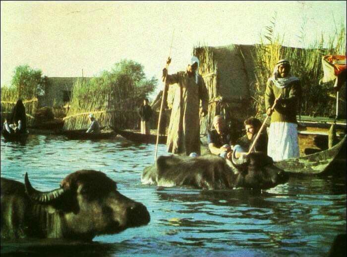
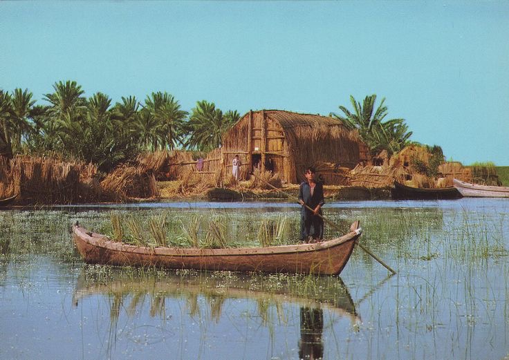
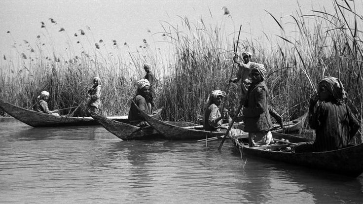
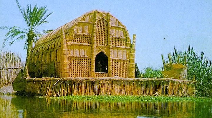
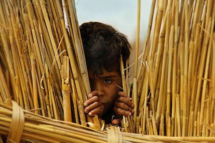
The second storyboard is more of a slice-of-life introduction to indigenous Mesopotamian characters from the Ahwari culture, set in Sumer in whats now Basra Iraq and was once the Garden of Eden. It follows two of my main characters, Aram and Lia, riding on a boat through this really beautiful landscape filled with golden Mudhifs (houses) on tiny green islands, lush reeds and turquoise blue waterways inhabited with wildlife.
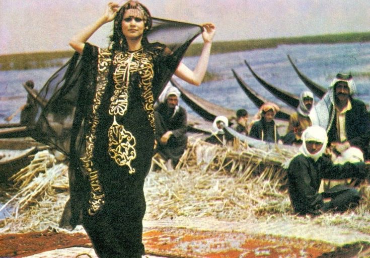
The camera pans out, transitioning to them disembarking the boat. The little girl runs home to play with her cow where both are adorned with gold jewellry, based on a real photo taken in 1966 Basra that you would think is a painting. Then the scene expands to show a network of waterways and ancient civilisation, transitioning into the background to introduce another elemental steward inspired by the goddess Ishtar and indigenous Iraqi women.


3*
Intro scene of Roots to Fate, animatic direction, camera movement etc..

4*
LANDSCAPE AND ENVIRONMENTAL CONCEPT ART
This scene is a sequence that explores different societies and biodiverse regions; something I want to expand further in my story through world-building and environmental design. For the audience I want to visualise the journey of my characters, applying Sarah's workshop exercise where we reflected on our journeys - within my design Im thinking about where they come from, what their journey is, and what “home” means to them.

The sequence transitions every 2- 5 second pace using the phases of the moon to to mark the flow of time and movement between spaces. It takes us from Namibia to the Mesoamerican rainforests of the Amazon - the Bushlands of Australia - Hills of Kenya - the Nile Civilisations of Sudan and Egypt - The marshlands of Sumeria (Iraq) - the Sieidi's of Sápmi ( Scandinavia) - the Great Mali Kingdom, Zimbabwe and Kush - the Indus Valley civilisation and Kerala - the Andaman and Pacific Islands... and continues through the semi-fictional world.

In these scenes, you see silhouettes or scenes of peoples livelihoods, ecological conservation agriculture, knowledge, wildlife, harmony and conflict, children, love and corruption - many nuances of humanities story. Alongside humanity are megalithic elemental beings in the background who represent the spirits of their respective land and inhabitants through animistic worldviews and myth. Taking the approach in The Art and Making of Arcane, each character is a universe in themselves, unique in their movement, visual design, tone, and expression.
For instance, in a scene set in ancient Kerala, the goddess Kali is depicted in the background. This large blue, eight-armed figure possibly performing the Tandava (specifically Rudra Tandava or Kali Tandava), a fierce cosmic dance representing creation, destruction, and preservation. These cultural and visual considerations for each character extend beyond a four-month timeframe, but they guide the ongoing development.


Ive always preferred drawing characters and living figures as opposed to inanimate things like buildings, which is why I could never go though studying architecture - hell no. However I felt inspired to take a character design and spiritual approach to creating semi-fictional landscapes such as this one of Sumer, modern Nasiriyah where the ziggurat temple of Ur and the marshlands once intersected as a costal civilisation. This has become a growing interest in my practice and I hope to create more detailed environment art for my degree show.
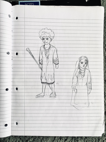
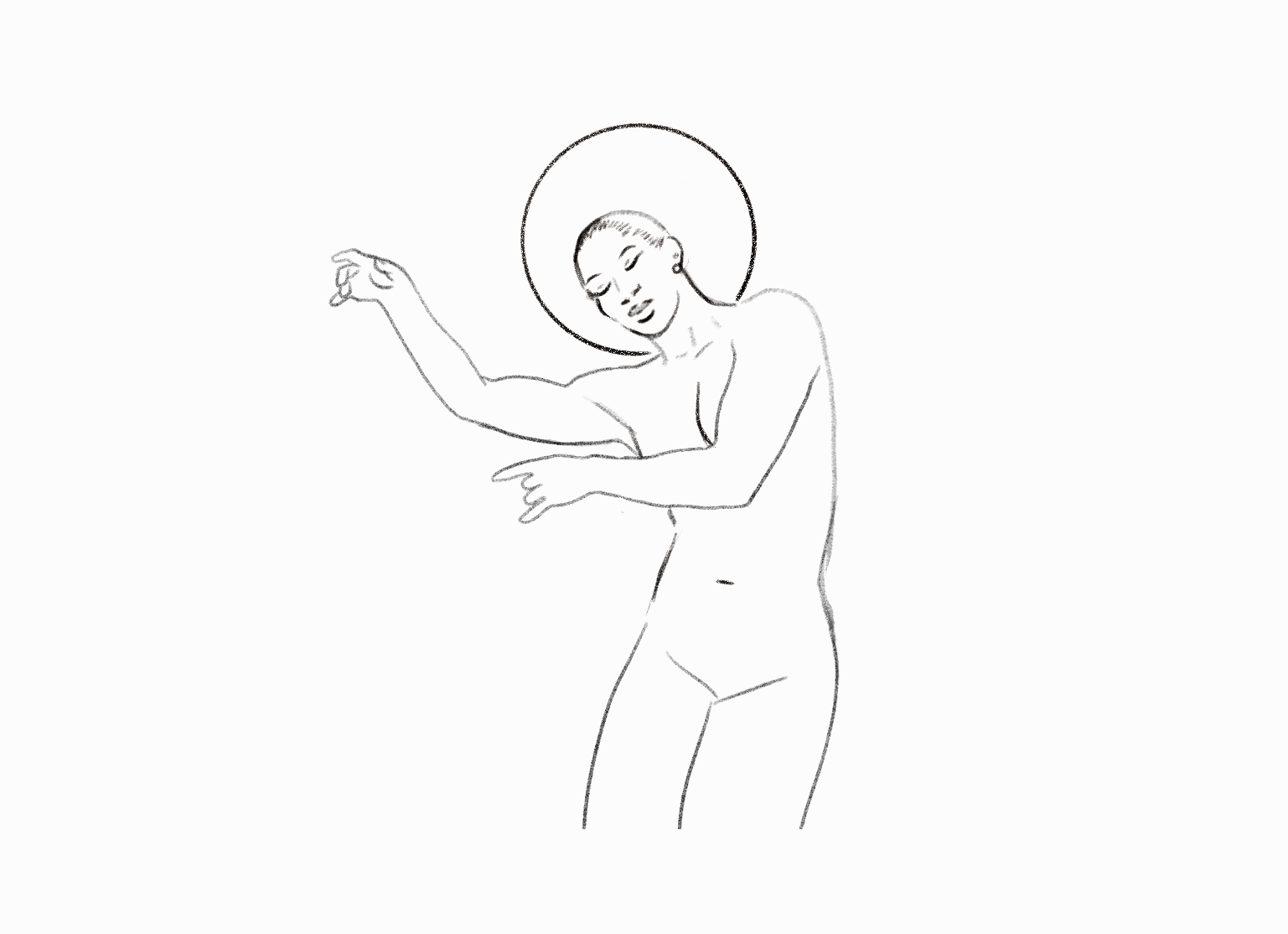
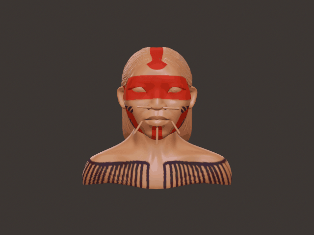
CHARACTER DESIGNS
PROCREATE - ILLUSTRATION - NOMAD
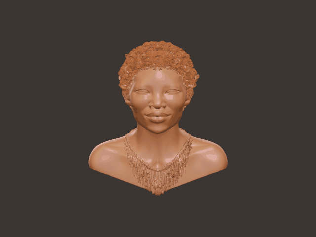
This is an overview of my character designs. This has probably been the most fun part of the project for me because I’ve been developing these ideas for a long time.
I started with the goddess of earth, Ki, who originally came from one of my earliest character designs when I was about 12. Over time she’s changed a lot, especially in her hair, which also represents roots and connection. Some of these designs might be familiar from my animatic.
I’ve also created characters inspired by different tribes and cultures, such as the Kayapó, the Guarani, Ainu, ancient Dravidian tribes.
PROCESS AND TIME LAPSES


Character design that inspired my runway look. Blending heritage and fantasy ~ indigenous attire and mythology ~ nature and fashion ~ maximalism and minimalism.
ETHNOGRAPHIC REFERENCES ~ PINTEREST
~ You can interact with these embedded mood boards, scroll down and right:)
These photographic mood boards that I’ve collected for years are like my babies. They're really useful for inspiration and reference when developing character designs and worldbuilding. Individual images often led me into deeper research through Google Search, helping me find historical, cultural, and visual references that added more context to the characters and environments I was creating.
ACRYLIC MARKERS


Bought these using my amazon voucher, I cant wait to try these out for my illustrations! I want to experiment and show variety to my concept artwork.
300 WORDS
ECOLOGICAL SITUATION - REVIVAL AND DESTRUCTION
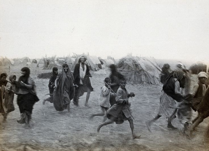
It's kinda ironic that this conflict which is bombing my country and endangering my family connects to this project. Corresponding to the 'removal' of US bases in the region, the marshlands have began to revive itself.
ANIMATIC
DEVELOPMENT
The hard part is getting started... and drawing.
SELF PERFORMANCE
ROTOSCOPING ON TOONSQUID


VIDEOS THAT MOTIVATED ME
I opted to use Procreate instead of Procreate Dreams because my device frequently crashed during research lab sessions due to limited iPad storage. My iPad only has a measly 64GB, with 30GB taken up by software updates, no matter how much I offload its not enough. I'm already familiar with Procreate, and it offers a simpler workspace, which I have to compensate for mentally by applying traditional animation principles to pure drawing.

PROCREATE COMPOSITION


ANIMATION TIMELAPSES


DEVELOPMENT
KEYFRAME AND PACING
LINE WORK AND IN-BETWEENS


In this scene my aim is to illustrate a diverse array of characters and cultures converging into a single motion right before the hands grasp the seed, symbolising the transformation of the seed into the earth. So the scene would rapidly transition between different characters, seamlessly moving from one to another. This approach, though complex, would simply and effectively depict a wide range of cultures in just a few seconds, highlighting how each contributes to the destiny of the earth.
COLOUR / RENDER / SPECIAL EFFECTS - PROCREATE
EDITING / SOUND / NARRATION - CLIDEO
The musics very intentional, this is a sample of a song that often helped me focus and work during research lab, particularly when I was making the initial storyboard and storyline. It was the perfect choice. Alternatively I liked the composition of the song Orbit ( The Outer Space Version) by Akshara.
POSSIBLE SOUND OVERLAYS - SPRING BIRDSONGS


WORKSPACE OVERVIEW
AN ANALYSIS OF MY ANIMATIC
MAQUETTE
DEVELOPMENT
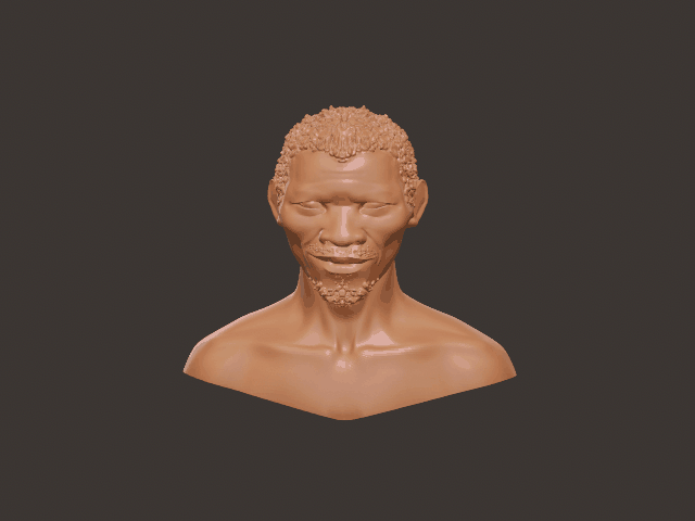
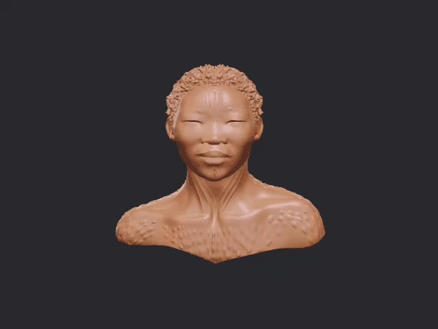
I chose to create the maquette as both a functional stop-motion puppet and a physical representation of my character Ki, the most ancient elemental spirit inspired by the world's oldest tribe, the San people. This adds another dimension of animation within project highlighting my 3D modelling growth over the course and my creative versatility to potential industries.
The sculptural maquette started with the intention of being a simple 3D-printed artefact of my main character, but I’ve always been drawn to the sculptural makings behind of stop-motion, inspired by Laika the Studios behind my favourite childhood movies Coraline and Kubo, and the then-recent Tim Burton exhibition; seeing all the animatronic details behind his character in real life. Being able to work in an industry like that and actually use my 3D modelling skills in a similar way would be amazing.
Combining world-building, sculpture, and animation to literally bring an a character to life is something I’ve never done before, but I’m really excited by the challenge and what I could do with it.
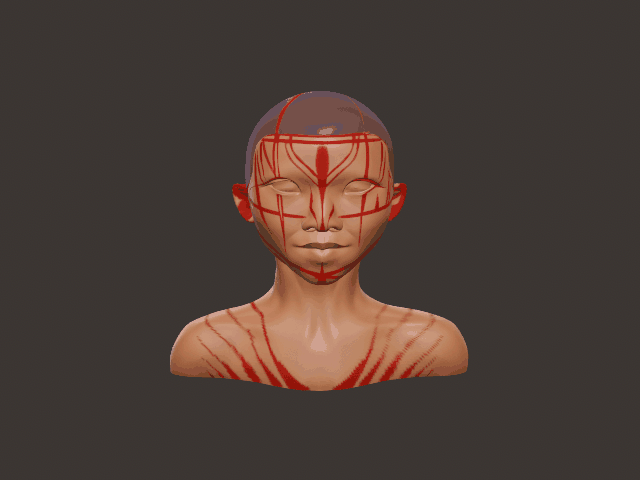
SCULPTING IN NOMAD


I started in Nomad Sculpt, following a couple of YouTube tutorials on how to turn a model into something that looks like a movie poster-style figure. I took the model I originally made in Research Lab, adjusted the pose and proportions, refined the form, added joints, and ended up with my first Maquette-style model.
PREPARING IN BAMBU LAB


I mainly wanted to test it out and see if it would actually function as a physical print. What I didn’t expect, though, was how much of a trial-and-error process 3D printing would turn out to be.
I initially expected the printing process to be really straightforward, something I could just get done in one session. Instead, it ended up taking around 11 attempts over the span of two months. I was naive.
3D PRINTING TRIALS
TRIAL 1

I was really excited to see how it would come out, but the first print ended up being way too small, the fingers were just tiny specks. I could have just printed a hands without joints, but I'm striving for full functionality, so it has to be scaled up 200%.
TRIAL 2


On the second attempt, I used a more sustainable PLA with a cornstarch base. I left to get lunch, and when I came back the filament had knotted, which was frustrating.
TRIAL 3 - SPAGHETTI


I then tried again, this time adjusting the settings more carefully and splitting the model into separate plates for the head and chest, the limbs, and the fingers. On the third attempt, the print turned into “spaghetti.”.. I contemplated my project there and then.
TRIAL 4


On the fourth attempt, the head and chest actually printed well, and the green filament worked nicely, since the head printed diagonally it created a nice wispy effect that suits the character. It still needs the arms and other parts. I also accidentally burnt parts of the nose while trying to fix a small printing mistake, and the holes in the lips are quite noticeable. But overall, I’m happy with how it’s progressing so far.
TRIAL 5 - I CRIED
Attempt five I didnt bother documenting because it failed again. The printer was faulty, the filament clogged in the nozzle, and it wouldn’t stick to the plate at all. After consistent failures and malfunctions, I had to get help from other departments. Over easter I came to Parkside almost every day to print.
TRIAL 6 - ACCIDENTAL PRINTS - ADM department CAD lab in Parkside.


During Easter, there was an opportunity to print without a booking. The technicians kindly allowed me to print. I sent the file, and the next day, the technician printed it without informing me at the time, but it does demonstrate the size difference between each variation.
TRIAL 7 HANDS


After that, I decided to print another version, starting with the fingers and hands first, to help work out how big the rest of the body should be. I could have made the hands non-moving, but I really wanted to try and achieve the level of detail I see in stop-motion animation and in things like Tim Burton characters. After assembling the hand, it moves at the knuckle, but the fingertips had to be superglued because they were too small.
TRIAL 8 FAILED BUT IN THE MEANTIME FASHION RESEARCH


After another 3D printing fail, I was waiting for a different print when I noticed a really interesting 3D printed pattern that looked like feathers or fur. I picked it up and immediately fell in love with it. It was exactly what I wanted to dress my character in, since it resembles a kind of traditional garment from the San tribe.
None of the technicians knew what it was since they got it as a sample14 years ago. After some quick google searching I found the original company but it has since been discontinued. It’s a powder-printed material, which realistically can only be done at places like Steamhouse or other very professional institutes or manufacturing companies.
It would be very difficult to recreate in any other way. I asked if I could take it, but of course I couldn’t because it was school property. If I were to develop it further, I would definitely try to find a way to replicate it. I also tried looking for similar patterns online, but had no success.
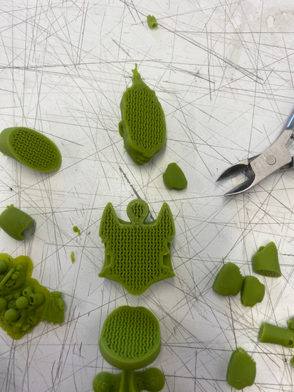
TRIAL 9


I printed another version of the upper half of my maquette, this time with limbs. The legs failed because they were too long and too large, so I decided to exhibit just the torso of the maquette without the legs. Canonically, my character doesn’t actually have legs in the main storyboard anyway - she’s part of the landscape. So to make it more accurate and less overwhelming in scale, I decided to only print and present the upper body.
Even then, assembling the body was very difficult. The joints wouldn’t fit because of tension differences. These models are normally meant to be much smaller. I even tried melting down some of the joints and parts with a lighter, but it still wouldn’t cooperate.
After all of that effort, I had to remodel it.
REMODELLING


NOMAD REMAKE


I spent the day remodelling the maquette in Nomad. I imported a pre-made maquette model from online and combined parts of it it with my original sculpt. This involved adjusting, resizing, hollowing, voxel remeshing, boolean integrating, and decimating the file sizes of each anatomical part, considering factors such as print quality, visual appearance, and keeping the file practical to manage. The main issue was that the original model was made at a much smaller scale than my maquette needed to be, so I had to readjust the proportions and tension between the joints. Hollowing out the sculpture also helped reduce material usage and weight for printing.
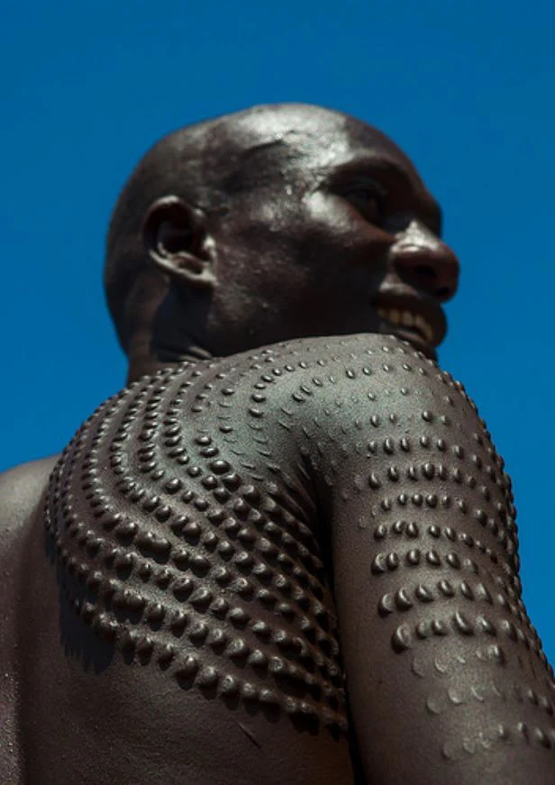
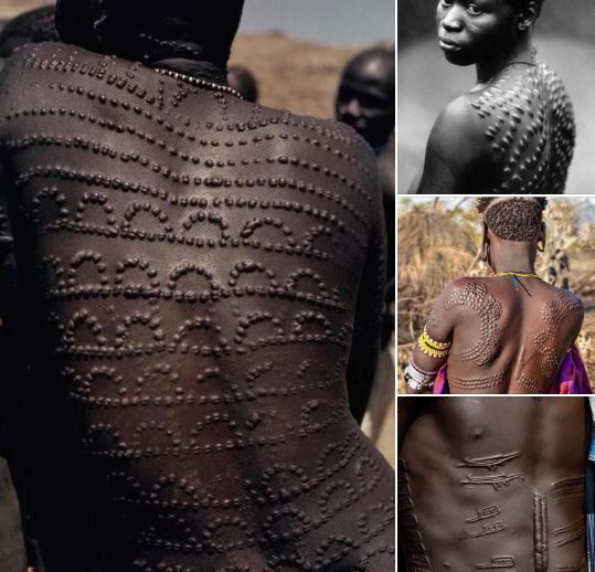
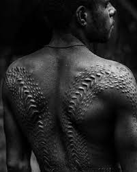
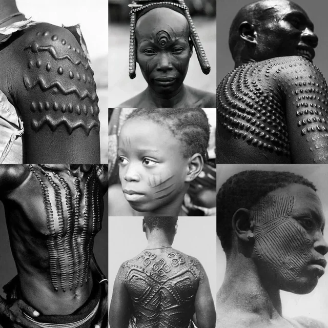
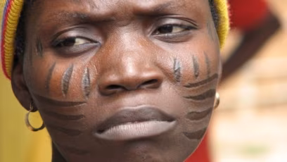
I devoted more attention to the surface details in this design than in the previous version. I incorporated patterns inspired by scarification from African cultures like the Dinka and Nuer but to also mimic leaves and natural shapes, highlighting the character as a steward of nature while retaining African influences. This approach also ties back to my solarpunk robot characters, merging speculative design, identity, and environment.


The fingers took a considerable amount of time because I aimed for anatomical accuracy, which involved essentially redesigning the entire hand and joints. I refined the fingers and added holes to allow wire to be threaded through, securing each joint. To enhance realism and the character's ethereal appearance, I included finger patterns and nail markings.
I also refined the eyes and facial features to achieve cleaner prints and resolve previous model issues. Finally, I added holes for earrings, allowing for future jewelry embellishments on the maquette. Overall, I am very pleased with the final outcome.
TRIAL 10 & 11 - Engineering Department


After Easter, I no longer had any chance of printing through the ADM department because bookings were completely full for the next two weeks. Luckily, after already building a relationship with the Engineering technicians before the break, they generously allowed me to print there instead.
Using the very last of my green filament - which I had to manually divide into two spools. - I printed my remodelled maquette and it turned out quite successfully.
Trial 12 - SUCCESS - ISH


Though one of the plates didn’t print properly, so I had to reprint it.
ASSEMBILY
When I tried to assemble it, I realised the PLA joints still wouldn’t fit. At that point, instead of trying to remodel everything again, I went to the workshop and embedded metal components and screws into the maquette instead, which made it work even better.
HANDS


FASHION DESIGN


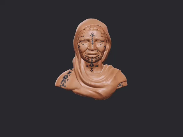
Cowrie shells hold deep significance within Southern African indigenous cultures, including the Khoikhoi (part of the broader Khoisan grouping), where they are valued as sacred adornments, symbols of protection, and tokens of prosperity. In Research Lab the documentary 'human' taught me that the earliest evidence of jewellery were shell necklaces found in ancient Botswana. They are used in traditional jewellery and attire, often integrated with other natural items like beads and metals, to signify fertility, life stages, and spiritual connection.


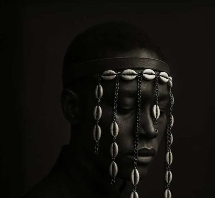


The downstairs exhibit hosted a photographic series by award winner Ayodeji Awoyomi; his piece highlighting the cowrie shells exactly resonates with my characters veil.
' The cowrie veil, symmetrically arranged, functions as both a shield and a relic part ritual armor, part ornamentation... it explores the intersection of ancestral memory, spiritual regality'.
RESULTS


STOP MOTION TEST
LEARNING DRAGONFRAME,
VIDEO EDITING, OVERLAYS, FOR PROJECTION
VARIATIONS USING GLITCHE


My vivid vision is to mimic the final scene of my animatic, where my main character Ki holds the earth in her palms. Upon David’s suggestion, I felt inspired to test out my stop-motion maquette by learning how to use Dragonframe. With Anna’s support I was able to pick it up very quickly and created my first ever stop-motion animation, which ended up being much more fun than I expected.
Despite the maquette being around 95% PLA, the movements were surprisingly fluid. There were some issues with the tension becoming loose at times, mainly because the heat from the torches softened the Blu Tack that was helping keep the joints stable. Even with these issues, it was a really valuable experience learning physical animation and being able to incorporate it into my exhibition work.
The idea of projecting my stop-motion animation into the negative space of my exhibition is perfect because it adds another dimension of animation. Instead of the animation existing only on a screen, the exhibition space itself becomes animated through these glowing, ethereal figures moving on the installation.
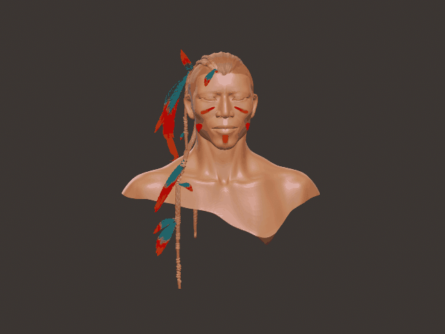
FURTHER SCULPTURAL REALISATIONS - ISHTAR


I started with one stop-motion maquette character and hope to include my secondary elemental character, Ishtar, representing Mesopotamia. I envision her as a glowing golden woman holding wheat and an ancient ziggurat temple, similar to how Ki holds the Earth.
By using editing, layered organic movements, and glowing visual effects, I aim for the stop-motion figure to look etherial when projected onto the exhibition boards, to create an immersive experience that transforms the space.
MATERIAL USE - SUSTAINABLE CORNSTARCH DERIVED PLA, REPURPOSED AND REPURCHASED


OVERVIEW
As long and frustrating as the process was, it actually taught me a lot. Even the failures ended up being part of the learning curve and helped me understand the technical side much more deeply.
DEGREE SHOW PLANNING
INTERACTIVE DISPLAY METHODS FOR THE DEGREE SHOW
DIY ARCHAIC MUTO SCOPE
recommended article:

BOOKLET
For my project, visual development is essential for communicating what the animation is about and what has inspired it, especially the ethnic roots behind it. In some ways, it actually says more than the animation itself, because it allows me to add extra context and meaning that you can’t always fully show in motion.
It gives space to explain the cultural, historical, and thematic inspirations in more detail, and brings in that deeper layer of representation and background. It’s also one of my strongest areas within the different outcomes. Some of the characters I’ve developed for the animation are completely new, while others come from older versions and iterations that I’ve reworked and evolved over time.
Looking ahead to the degree show, I’m hoping to continue developing more sculptural elements of the work through resin printing now that it’s post-deadline. I also looked into more sustainable resin options for the Formlabs printers, but there were very few available beyond partially plant-based resins.
MASKS


Another potential development is 3D printed mask sculptures mounted below the screen, and partially painted to blend into the wall a bit. This intergrates previous designs of indigenous people that I based some of my characters on, physicalising them into these ancestral masks.
NETWORK EXPERIENCE
OVERVIEW
SARAH AL SARAAJ:
It was great connecting with Sarah, already learned from her and the workshop, and we re planning to communicate in June given our busy schedules.
TESTIMONIALS
I wish I could've networked more on social media, but its much more effective having actually pushed out my project for public engagement. Through its further development having promoted my work, crowdsourcing perspectives is and important step - from researchers, indigenous members, creatives - involving them in post production is essential to the cultural integrity of the story.
Birmingham Open Media BOM

Back in Futures Lab, I set up an early agreement with members of Birmingham Open Media to support my Creation Lab project - to come in an hour a week to use the 3D print and Rokoko facilities. This fulfilled my research proposal way before the start of the project, but despite initial confidence, this didn’t go as planned. Communication became messy due to busy schedules with the upcoming showcase. The third time popping by I spoke a higher authority, Louise Latter, who respectfully told. me the support wasn’t feasible as a non member of BOM. Yet she also explained the prospects of applying for the next Immersive Arts Bootcamp, which I want to eventually join to develop my software modelling skills. Given they'll also see my work at the degree show I'm more likely to be eligible.
Looking back, I relied on this arrangement, and when it fell through, along with our classroom printer , I had to quickly find other solutions. Right beforeEaster break I started reaching out across Birmingham City University departments like ADM, Engineering at Parkside, STEAMhouse, and Animation, to use the facilities through relationship building with technicians. Surprisingly, despite Parkside housing hundreds of 3D printers, as an Art and Design student I couldn't access them. Even the booking system within the ADM department was inaccessible and no luck came from emailing management, same went for the facility leader of Steamhouse. During Easter, I came in almost every day to work on the maquette alongside my animation. In retrospect cross-departmental networking became vital to both the progress of the overall project.
CAD LAB BCU
NEW RELATIONSHIPS
When I first got to the AMD printing room I instantly made friends with technician Rowan and graduates Sanjee, Reneya and Bisma, who were really lovely and curious about my sculpture and even gave me advice. It was nice coming in and seeing everyone over Easter. Im thankful for friends I met and the support I was given for that time being, including Daniel the other technician.
THE PERFORMANCE OF ADULTHOOD : EXHIBITION BY SANJEEVE GUNARATNAM


While I was developing my project, Sanjeeve and others were also curating an exhibition. When I attended, I got to see the amount of effort and process that had gone into it, and how it all came together in the final space. It gave me a lot of motivation for what my own project could become in the exhibition.
Over the last nine months, Sanjeeve has undertaken a residency within the Department of Architecture and the Built Environment. It was one of the strongest exhibitions I’ve seen. In the future, we’re hoping to collaborate on a project together, or just have fun 3d modelling characters. I’m super proud of the guy.
Since he is also a contributor to Studio.zine, working across illustration and post-production, he exhibit opening also hosted a zine making workshop Studio Zine ran by Bismah. This inspired the idea of potentially making a zine variation of my concept art book - insta
MORE ABOUT THE ARTIST:
ANIMATION DEPARTMENT BCU
Murray John was the first to welcome me into the department and was very enthusiastic and supportive when I showed him my work and Research Lab presentation. The next week, I got to converse with Shaun Magher and Kelvin Wong to see if I could receive any feedback or support from them. Bearing in mind they are professional animators that have worked and mentored in big studios like Disney. Kelvin suggested that I attend the Friday Tutorials after Easter and mentioned that I'm welcome to come in and relax in the department while working on my animatic.
PROFESSIONAL INSIGHT - FRIDAY TUTORIALS
FRIDAY 1: I worked on keyframes in the animation room until the tutors arrived. Murray encouraged me, despite my doubts about my progress. While drawing redrawing my Tiamat logo Murray wore a rock band t-shirt featuring the same Tiamat, which was a wild coincidence. He recommended I watched this video to help me start compositing my animation.
FRIDAY 2: Kelvin reviewed my work and advised starting with simpler scenes, like the eye, before tackling complex ones, and reusing frames when possible. He explained that animators work in a pose-to-pose sequence, not sequentially or randomly as I had been doing. I learned to treat my animatic as a sequence with a starting pose, an ending pose, and fill in the gaps.
BLENDER ( FIX )
Though BOM never got back to me a student from animation department at bcu recommended that weight painting is a potential fix to my blender dilemma from research lab. I took his advice for future .
FRIDAY 3: The following week, I returned to the department to work on my animation while awaiting feedback. I showed Murray my latest animatic, and he advised keeping the original line work visible in the proof-of-concept animations alongside the rendered versions. He explained that rendering can sometimes obscure the line work and animation flow, while rough sketches better communicate movement and ideas. This advice was reassuring and greatly benefited the project. The other students were also friendly and provided useful feedback and encouragement.
ENGINEERING DEPARTMENT BCU
Just in time before Easter, I went to the engineering department for help. That is where I met Junaid and Khush. Through communicating with the different teams, and reaching a point where it became impossible for me to print anywhere else, the engineering department became my last resort. Thankfully, they let me print it. I hope to continue resin printing more sculptural pieces for the degree show with support from the engineering department.
S.T.E.A.M.H.O.U.S.E ( HATCHERY )
Over Easter I visited STEAMhouse three times in an attempt to get in touch with Chris Evans to use the 3d printing facilities, with no luck. During my first visit, a member of staff mentioned the Hatchery programme, which I had already heard about through my teachers, careers advisor, Janine Jones, online sources, and through seeing that Zoe had completed the programme.
I had first looked into the Hatchery around a year ago after reaching out to Janine on LinkedIn, but at the time I didn’t feel ready to apply. Now I am.


I decided to put myself forward. My teachers were also very supportive and encouraged me, and developing my blog, report, and presentation helped me better clarify and articulate my work. The higher possibility of developing the project further with proper support is really exciting.
SELF PROMOTION STRATEGY
This project encouraged me to overcome posting anxiety and start posting consistently on social media; something I long struggled with. I need to promote my exhibition so I had come up with a plan - prepare content and post passively older art I wanted to show towards my deadline. After the deadline I have time to properly curate social media content of work Ive done over this course, particularly Roots to Fate. Over a month towards the exhibition I will promote my project, journey and creative practice on instagram, ticktock, youtube and linked in. The degree show/post graduation is a great opportunity to build engagement through social media, to potential collaborators, investors and audiences, so I must take advantage of that.
⋆.˚⟡ ࣪ ˖ UPDATED PORTFOLIO⋆.˚⟡ ࣪ ˖
PROJECT FINALE
INTRODUCING ROOTS TO FATE ( ANIMATIC )
CONCEPT ART
STOPMOTION MAQUETTE


FINAL PRESENTATION
2000 WORD REPORT
DISCLOSURE
After the presentation, I felt a strange sense of déjà vu feeling same as my Futures Lab presentation where internally I was nervous even though I did well. In trying not to go over the time limit there were definitely things I missed out or points I could have expanded on further, but I did my best.
One moment that really caught me off was being asked what was biggest challenge of the project? Truthfully, it was the burnout and the emotional weight of everything happening around me over the months: the fear for my family, the responsibility of caring for them, concern for family back home living in the crossfire of war, not knowing if they'll die, my mom and sisters health deterioration, on top of my personal stress, health struggles, fatigue amongst the state of the world.
I could have disclosed that during the presentation, but I wasn’t sure if it was appropriate in that context of the project itself. Alongside cross-department communication and linework the biggest challenge overcoming that stress, pain, and demotivation, and eventually finding joy and purpose in creating again. It took a lot of strength to regulate myself and continue pushing forward with this project, despite the situation around me not changing much.
Regardless I’m very proud of the work I’ve created and all I put into it.
THE FUTURE
In a way, this project reflects my past, present and future.
From the earliest sketches from when I was 12, to those visions now being animated into life, I feel very hopeful about the future, and certain of what I want to create, and who I aspire to be. This is something I am determined to hold onto - I'll continue creating art and learning as long as I can.
For short term future I will continue developing my animatic for the Degree Show, alongside my portfolio and practice. I'm also buying myself a nice Bambu 3D printer, post more, commission and exhibit work. Long term, the goal is to develop Roots to Fate into larger fully animated anthology and potential Webtoon comic. I aim to gain more opportunities, exposure, feedback, and connections, while continuing to build my skills in animation, 3d modelling, and visual design as a interdisciplinary creative.
Finally, I want to express my gratitude to my amazing tutor Lara Furniss, my classmates and everyone who has supported me. This three-year journey have set me on a new path, thank you for everything.
GOODBYE:)
